Apache Beach (ab)是Apache自带的一个性能测试工具,专门用来测试网站的性能, 不仅限于Apache web服务器。
它可以同时模拟多个并发请求,测试Web服务器的最大承载压力,同时也可以根据Apache Bench提供的测试结果对服务器性能参数进行调整。它可以记录测试数据,其它工具比如Gnuplot可以利用测试数据进行分析。它也可以提供一个summary,可以直观显示当前测试的web服务器的性能。
- 安装ab
ab是Apache httpd的一部分。不同的发行版提供了不同的安装方法。
比如在笔者使用的redhat 6.4上可以查看此工具在哪个包里:
1 2 3 4 5 6 7 8
| ...... httpd-tools-2.2.15-30.el6.centos.x86_64 : Tools for use with the Apache HTTP : Server Repo : updates Matched from: Filename : /usr/bin/ab ......
|
它被打包在httpd-tools包里,安装httpd-tools:
安装成功后查看帮助:
或
注意网址后面要加"/"或者明确的path如"https://www.google.com/?gfe_rd=cr&ei=_BvfU77ZGMeL8QfugIHAAw".
"-c"是并发数,可以模拟同时有多少个clients并发访问。
"-n"表示总的请求数。每个client发送的请求数为此数字除以client数(上面的数字)。
"-t"可以指定测试的最大时间,如果还不到此数请求已经发完,那么测试也会结束。当使用-t参数时,ab内部默认最大的请求数为50000,为了同时使用"-n"指定的参数,可以将"-t"参数放在"-n"参数之前, 如果想了解更多的信息, 可以查看这篇文章.
- 实际运行ab
我使用apache ab要测试的是一个tomcat搭建的集群,上面跑着CPU密集型的一个应用程序,前面使用nginx作为load balancer。
此应用的一个主要的服务通过RESTful service提供, 并且是POST类型的。 Request body是一个XML。
我想随机的替换body中的一个属性,以便测试动态请求对服务器的影响。 但是Apache ab只能提供静态的数据,所以我下载了它的代码并改造了一下。
首先创建了一个request.xml, 并将其中的那个属性改为占位符 修改ab.c文件,将发送请求中的占位符用随机数代替
修改的代码可重用性不高,在这里就不贴了。
写了一个脚本,可以测试不同的并发数:
1 2 3 4 5
| for var in {4,20,50,100,150,200,300} do ab -g plot/biz$var.dat -r -c ${var} -n ${total} -H 'Accept:application/xml' -p request.xml -T 'application/xml' http://localhost:8080/app/biz done
|
- 使用Gnuplot生成图表
在上一步中生成了测试数据,我们可以通过Gnuplot这一强大的工具生成漂亮的图表了。
在生成图表之前,我们还需要处理一下获得的数据,
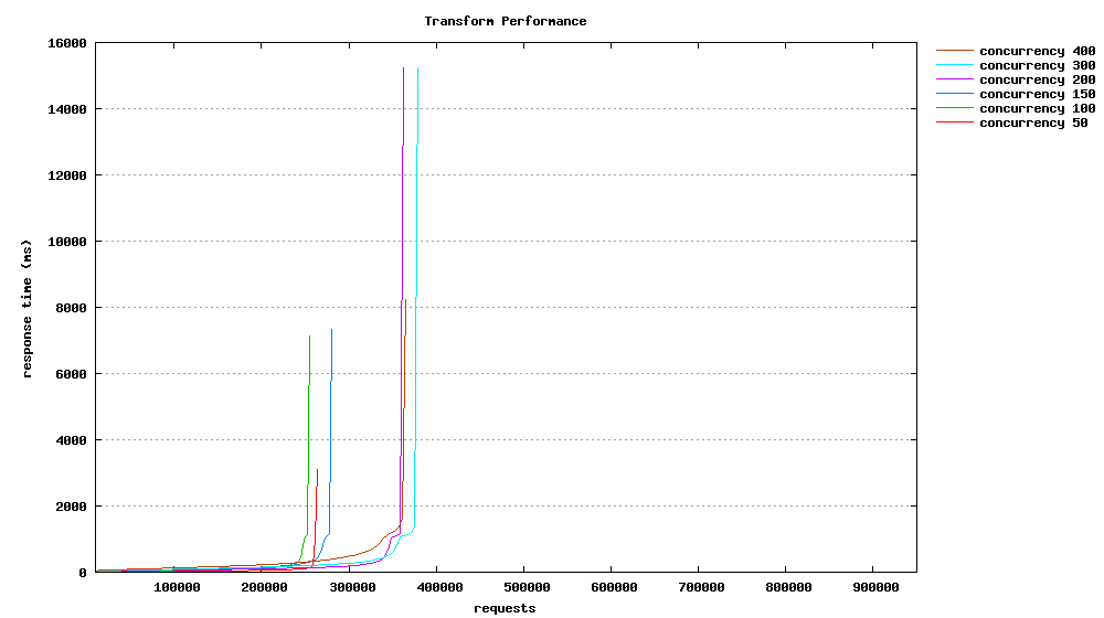
如果直接使用测试生成报表,我们可能得到这样一个图表:
 .
.
相应的Gnuplot文件为:
1 2 3 4 5 6 7 8 9 10 11 12 13 14 15 16 17 18 19 20 21 22 23 24 25 26 27 28 29 30
| #output as png image set terminal png size 1000,560 #save file to "domain.png" set output "biz.png" #graph title set title "Biz Performance" set key invert reverse Left outside #nicer aspect ratio for image size #set size 1,0.7 # y-axis grid set grid y #x-axis label set xlabel "requests" #y-axis label set ylabel "response time (ms)" #plot data from "biz.dat" using column 9 with smooth sbezier lines #and title of "Biz Performance" for the given data plot "biz4.dat" using 9 smooth sbezier with lines title "concurrency 4", \ "biz20.dat" using 9 smooth sbezier with lines title "concurrency 20", \ "biz50.dat" using 9 smooth sbezier with lines title "concurrency 50", \ "biz100.dat" using 9 smooth sbezier with lines title "concurrency 100", \ "biz150.dat" using 9 smooth sbezier with lines title "concurrency 150", \ "biz200.dat" using 9 smooth sbezier with lines title "concurrency 200", \ "biz300.dat" using 9 smooth sbezier with lines title "concurrency 300"
|
这张图有参考价值,我们可以看到大部分的请求的相应时间落在那个数值段中,但是不能以时间序列显示服务器的性能。 它是以"总用时“ (ttime) 进行排序,所以一般它会一条上升的曲线来显示。
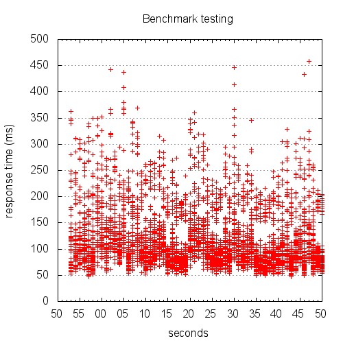
这篇文章中指出了一种按照时间序列显示数据的方法。 Apapche ab生成的测试数据中已经包含了时间戳,可以修改Gnuplot生成按时间序列显示的响应时间图:
 .
.
Gnuplot文件为:
1 2 3 4 5 6 7 8 9 10 11 12 13 14 15 16 17 18 19 20 21 22 23 24 25 26 27
| set terminal jpeg size 500,500 set size 1, 1 set output "graphs/timeseries.jpg" set title "Benchmark testing" set key left top set grid y set xdata time set timefmt "%s" set format x "%S" set xlabel 'seconds' set ylabel "response time (ms)" set datafile separator '\t' plot "data/testing.tsv" every ::2 using 2:5 title 'response time' with points exit
|
为了得到按时间序列显示的吞吐率图表,我们可以处理一下得到的测试数据:
1 2 3 4 5
| for var in {4,20,50,100,150,200,300} do start_time=`awk '{print $6}' plot/biz$var.dat | grep -v 'wait' | sort | uniq -c|head -1|awk '{print $2}'` awk '{print $6}' plot/biz$var.dat | grep -v 'wait' | sort | uniq -c|awk -v t=$start_time '{print $2-t,$1}' > plot/epochtime$var.dat done
|
然后根据一下的Gnuplot配置生成图表。
1 2 3 4 5 6 7 8 9 10 11 12 13 14 15 16 17 18 19 20 21 22 23 24 25 26 27 28 29
| #output as png image set terminal png size 1000,560 set output "throughput.png" #graph title set title "Throughput" set key invert reverse Left outside #nicer aspect ratio for image size #set size 1,0.6 # y-axis grid set grid y #x-axis label set xlabel "time" #y-axis label set ylabel "responses per second" plot "epochtime4.dat" using 1:2 with lines title "concurrency 4", \ "epochtime20.dat" using 1:2 with lines title "concurrency 20", \ "epochtime50.dat" using 1:2 with lines title "concurrency 50", \ "epochtime100.dat" using 1:2 with lines title "concurrency 100", \ "epochtime150.dat" using 1:2 with lines title "concurrency 150", \ "epochtime200.dat" using 1:2 with lines title "concurrency 200", \ "epochtime300.dat" using 1:2 with lines title "concurrency 300"
|